Business Intelligence (BI) technologies like Power BI and Tableau collect, integrate, analyze, and present business information. These tools can help you analyze business data and visualize information to gain valuable insights.
Creating a dashboard that provides some insights can be a quick process (especially once you gain some expertise with the BI tool of your choice). Even an expert may notice that things can get tricky and time consuming once you try to do one (or more) of the following:
- Connecting to multiple data sources
- Playing with data types and data categorization
- Creating data models that mix together your data sources
- Creating a visualization that plays with multiple levels of aggregation
- Automating your dashboard refresh
BI tools allow you to present your data, create user views, and sometimes perform Row Level Security. Now, both PowerBI and Tableau offer their own features for more complex use cases like the above. These functionalities can be helpful to build a one-time quick analysis, but fall short when trying to build effective, scalable and stable visualizations with a wide, demanding audience. Most of the time, after an ad-hoc analysis is built, Data Analysts are required to turn it into stable reporting, facing the challenge of automating the work smartly.
The trick?
Decouple (separate) your data preparations from your analytics and stick to using BI tools for visualizations and formatting. By simplifying the process as inputs and outputs, you will invest in your own future mental health and your customers’ satisfaction. Decoupling implies that each step is done using the most appropriate tool, leaving each aspect independent, simple and automated. Great, but how?
Those are the steps required to separate the stages of your data journey. Note that you should be able to follow these steps no matter how technical your background is (from basic excel files to complex Python flows). You can always adjust your approach to decouple your process and enable your future self (or your backup/replacement) to repeat/update/change it. Nobody should have to dissect a file every time they want to make a small change because it has turned into a black box.
UNDERSTAND THE ULTIMATE DASHBOARDING REQUIREMENTS
Start by carefully listening. Customers and end-users (or Product Owners) will come to you with wish lists and must-haves. They will be focused on the final look and formatting of what they want to see. Keep in mind that is that the purpose of reporting is to:
- Analyze the data
- Draw conclusions
- Make better decisions
For example, when they say “I need A and it should show B”, your next question shouldn’t be:
- What color?
- What size?
- What type of chart?
Instead, find out why your Product Owners want to see that metric. Ask yourself: What are they trying to accomplish? When you understand their priorities, you can answer important questions before starting to analyze their data:
- Is this an ad-hoc analysis?
- What question am I trying to answer?
- Who is my audience?
- What level of detail are they used to?
- Will this reporting facilitate a recurring discussion?
- What is the format of that discussion?
- How can I make sure these discussions revolve around solving problems? (instead of focusing on the origin of the numbers or what they mean for each participant?)
It comes down to trust. If your customers know that you understand their needs and take the time to clean and optimize their data, they will trust that it reflects their reality. This is what every customer wants. Data that they can trust.
After a couple of conversations, you should have a clear scope of the work that is needed, the purpose of the dashboard and what they plan to do with it, allowing you to execute on the work quickly.
ACCESS THE DATA
This is the stage of the process in which your multitasking skills are tested. You can make a list that looks something like this:
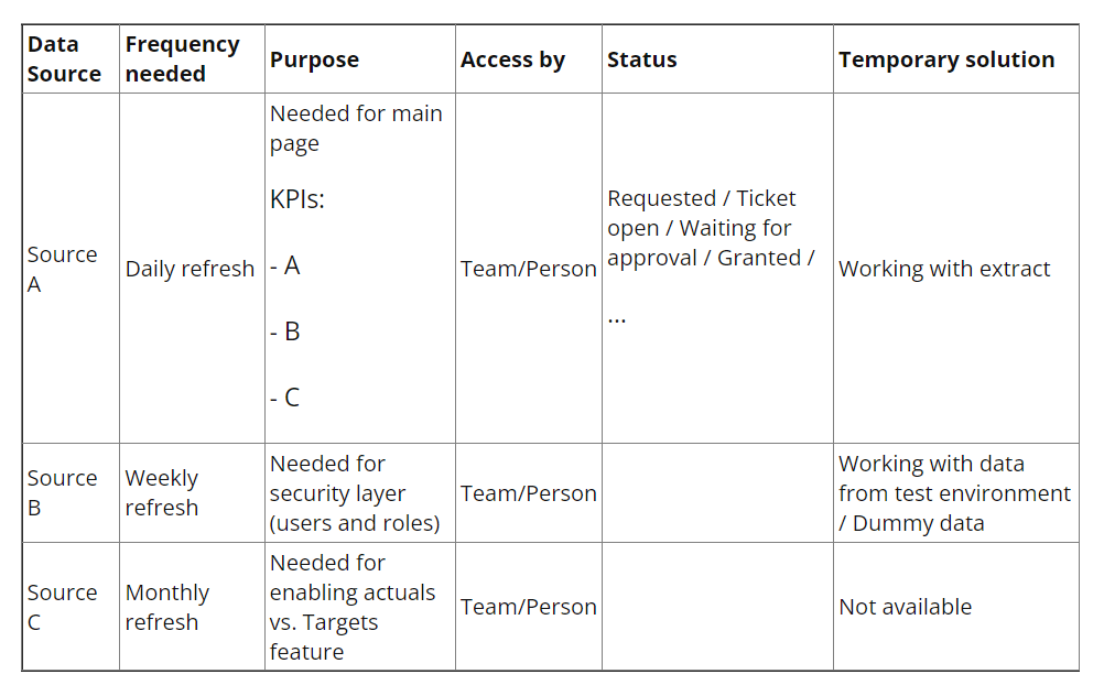
This will help to keep track of what you want and what you don’t, while also protecting you from bottlenecks. The last thing anybody ever wants to hear in business is excuses, so give them the facts. This is what I have and what I don’t and this is what I’m using while I’m waiting for it. Your Product Owner will know exactly where your data stands and how to help you progress quickly to a solution.
It’s important to show your partners resourcefulness (working with something while the final access is pending) and transparency (they know exactly why a certain part of the solution is not built yet or is working on non-production data). Keeping them engaged and building their trust will save you time and prevent obstacles in the future stages of the process.
INGESTING (FETCHING) THE DATA
Start with the quick wins to secure a simple Demo early on in the process and focus on having some data already at your disposal. Take the data in its rawest forms, instead of processed data that nobody is accountable for. If taking the raw data makes it too large, then work with a subset. One of the typical mistakes is to aggregate the data too early in the process, only to realize you actually need more. Ingest a raw subset of each of the data sources needed for a Demo.
At this point (and no later!), take notes and document what you’ve taken, and inform your customers that you have acquired enough data to build the first demo. Some dashboards might require over twenty different sources of data,combined in a variety of ways that are impossible to remember. Here, after ingestion, is where you start your ERD (how to build an Entity Relationship Diagram) or for simpler use cases, build your database diagram to simply document what you have (or plan to have). You can simply do this using pen & paper, a whiteboard, a digital whiteboard tool (such as Excalidraw, Microsoft Whiteboard, Visio, Google Draw…), or markdown (mermaid ERD), as long as you understand what data you have and how it will be merged into a final flat table.
COMBINE THE DATA
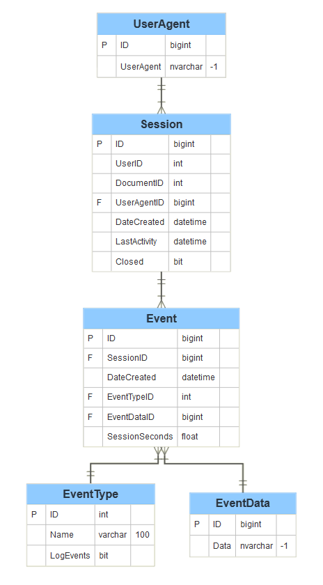
Here is where you create the most value. By establishing strong relationships among your data, you build clean and complete operational datasets that make life easier for your end users. Ideally, they can connect to the product in a matter of seconds (using SQL, Python, Tableau, PowerBI…) and directly start analyzing. It is not an easy task and it depends on how well you completed step 1 (Understand the ultimate requirements). As with any tricky task, start by breaking it down into steps and using a visual example:
In the current example, we have five datasets (UserAgent, Session, Event, EventType, EventData).
Use your visuals (built on the previous step) and make sure each of your raw datasets has a unique key that can be used to create the connections with other datasets (this can be custom ids from data sources, auto-generated keys). You might need to clean up (careful with the data types!) certain fields and generate your keys (e.g add a column with concatenation) to make sure the connections work.
In this example, each UserAgent has an ID, each session has its own ID and also the UserAgentID that it relates to. During a session, an event happens (new ID). Take a moment to recognize which will be your core dataset(s), meaning those that are on the same level you will be reporting on ? this will help you build all the connections and join as needed. Here are some scenarios:
- UserAgent level analysis: End-users want to have a dashboard that allows them to understand how many UserAgents are appearing and what the engagement is (number of sessions and events per session). You will need to take the ‘UserAgent’ dataset as your core, then add the Sessions and the Events as complimentary info to help you answer questions about the user.
- Session analysis: End-users want to have a dashboard that shows how many sessions are taking place, along with some characteristics of the users or the events related to those sessions. The core would be ‘Session’, joining to ‘Event’, ‘EventType’, ‘EventData’.
- Event analysis: End-users want to have a dashboard that allows them to understand the most common events happening during user sessions. Here the core will be ‘Event’, joining to ‘Event Type’, ‘Sessions’, ‘EventData’.
Your dashboard might require all the above. You may have to focus on different datasets, so if you did the first step correctly you will know that you need more than one operational table as part of your product. Perform your joins (using SQL, Python, data crunching tools or even Excel in the earliest phase) and check the number of records regularly to prevent a generation of artificial rows when joining tables and create the first, simple versions of your operational tables.
Add all calculations that your end users requested directly on your model (and not on your visualization tool). Each time a user will need to use this calculated data, they will get it directly from the dataset instead of exporting it from your dashboard. This also scales better and prevents data discrepancies between different dashboards built by multiple users.
Now that you have the first operational data, back to multitasking. You can build a quick visualization demo that your end users can use to give you feedback on the data accuracy, while you focus in parallel on the next step.
CLEANSE & FORMAT THE DATA
Take a first glance at your data to determine what data you are using. Then take somewhere between the first and last 10 rows and pay attention to the small details. This includes:
- The data type (numeric, text, dates, boolean, array)
- The data format (decimals, integers)
- Whether the raw data format is similar for all columns with the same data type (e.g. if all columns with dates has the same date format)
- Whether it is numerical (quantitative) and categorical (qualitative) data
- If text data -> what is it? City names? Product codes?
All of this helps to understand relationships between data, to determine what preparation/processing the data requires and to adjust visualization techniques. Remember to look for nulls, numeric / text, different formats between languages (for free text), and HTML tags cleanup.
This can be done by filtering or through a quick summary. All of this will prevent tedious steps later on during visualization – if the data is clean and in the right format, preparing a visual may take only a few clicks.
Next, go to the details. Depending on the data types, the approach to data cleansing differs, and different kinds of ‘outliers’ may exist. This is what to look for in a particular data type:
Dates
- Check the data type under which the data is stored. If the data is not related to dates, there is risk that the date is processed as a numeric value, which will cause the zeros at the beginning to be deleted.
- Maintain consistent formatting (e.g. ‘YYYY-MM-DD’)
- Dates should only be used if they make sense (e.g. birthdates shouldn’t be future)
Text
- If the text is long (e.g. tweets), use the tokenization method
- Ensure names are consistent (e.g. data might contain records with ‘USA’, ‘United States of America’ and ‘U.S.A.’)
Numeric
- Be consistent with formatting (e.g. decimals with two places, integers should look like integers, not decimals, etc.)
- Detect outliers (e.g. via visualization, Z-score method, IQR method outliers can have a significant impact on metrics which is why it is important to determine why they occurred and whether to remove/fix them. They could include information that might be key for business (e.g. frauds).) Outliers is a big topic!
- Commas or periods -> be consistent
Also, if you have categorical data, make sure categories make sense with no two categories that apply to the same thing. Remember to document the categories you create/adjust, so that users will know exactly what they mean.
Provide column names.
- During processing/modeling remember simple, descriptive column names, avoid ‘ ‘ between words and special symbols to save yourself from unnecessary trouble
- For final model for business use column names they want
- Adhere to a naming convention (or create your own following guidelines), document it and familiarize your data users with it. Be consistent with it across datasets and you will slowly build a culture in your organization of clean data that everyone can understand
When you understand your Product Owners’ priorities, business intelligence technologies like Power BI and Tableau can optimize and prepare data for Tableau and PBI dashboards. Once you have access to the data, you can ingest, combine, cleanse, and format it.
At this point, you might be ready to jump to your BI tool (PowerBI, Tableau, etc.) to perform these steps in one file connecting to a million raw extracts. Resist that urge and trust the decoupled process! Remember, simple is the keyword here.
- Listen, listen, listen
- Make lists that will work as a reference
- Break things down into smaller separate steps (data ingestion, data validation, data cleaning…)
- For data crunching, use tools that were built for automating data modeling(Python, SQL, visual SQL, even Excel if that’s what you’re comfortable with)
- Stick to visual tools for the final dashboarding
Don’t forget to document your progress! You will move on to your next interesting project and most likely forget all the details. This was not covered in this article, but take a look at how to build processes that speak for themselves and save time at the end when your deadlines are rapidly approaching.
“Your future self will thank you!”
This article was originally published by KDnuggets, a leading site on AI, Analytics, Big Data, Data Science, & Machine Learning, on their website.